Online store development – 8 reasons why customers leave the online store


If you plan to create an online store that is focused on the profits, customer and development of the company, be sure to read this article! Over the last couple of years, e-commerce sales have risen sharply, so the demands and habits of online shoppers have also increased. We have compiled 8 main reasons why customers leave the online store without making a purchase. Do not make these mistakes in the development of the online store!
NO. 1 Long purchase path, complicated purchase processing
One of the main reasons why shoppers leave the online store is too long and complicated the process of making and paying for a purchase (checkout). The purchase process begins at the moment when the customer presses the "buy" or "add to cart" button.
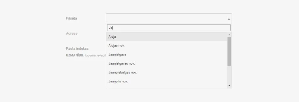
This process should be as simple and fast as possible. Often, at this very stage, the buyer "falls off", because it is necessary to fill out long questionnaires, for example, delivery data, or enter personal information (personal identity number). This step can be shortened if the customer does not have to manually manage everything himself, but when starting to write, for example, the name of a city or street, optional options already appear in the box. It also reduces the likelihood of errors. In this way, the process can also be made easier for businesses, if at the time of drawing up the purchase, the company enters the VAT number and the rest of the company information appears.
The second most common situation where a customer is lost is the payment process. Before developing an online store, think about having more than one payment option in your online store. There will be customers who want to pay quickly and wait for the delivery of the item. These customers are more likely to prefer card payments. And there will be cautious customers who will prefer to pay for the purchase after receiving the invoice or with redirection to the Internet bank.
Of course, if the value of the product is very high, the purchase process will also be longer. For example, when buying a computer, the purchase path can be longer due to the research of the item, the price is evaluated, the conformity of the product with the needs, etc. Both the purchase and the warranty of the product are formed by filling in the purchase form. If the value of the product is high, buyers will go through a longer and more complex process. But for everyday goods such as clothing, food, accessories,.c etc., people are not ready to spend a lot of time and fill out complex forms of purchase, so the basket will be abandoned.

NR. 2 Lack of a personalized shopping experience
When collecting user behavioral data, the site offers a personalized list of products according to the products previously viewed by the user, thus showing a range of products that might really be of interest to the user.
For example, if you view a handbag in the online store, you can look at more models. A lot of online stores already practice this practice, showing in addition to "You might like" or "users who viewed this product also watched this".
Imagine the situation when you enter the shoe store, you have found shoes that you like very much, but are not your size. The store consultant offers to look at similar models of your size. This increases the probability that the customer will not leave the store empty-handed and the purchase will still be made.
This practice is used by such large brands as LMT and 220.lv in their online stores.
In turn, without using personalized shopping, the customer is presented with the entire range of products, which prolongs the entire shopping process. People nowadays have become very impatient and do not want to spend half a day searching, so your task is to make this process as easy as possible in your online store.

NR. 3 Ill-considered website design
Just like meeting a person for the first time, or going to a job interview, as well as visiting a website, visual impression is the first and most important. In about 3-4 seconds, users get their first impression of the online store, which determines whether they will leave it or stay. Outdated or unprofessional design:
- – Unoptimised/inappropriate images
- – Unsuspecting color palette
- – Chaos in the visual hierarchy (style, spacing, arrangement)
- – No CTA (call to action) button
- – Incorrectly formed content (Fonts, their color, dimensions, and background)
Such a design of the online store negatively affects the user experience, which in turn affects the customer's reliability in the quality of the company's product or service. It is clear that no one wants to buy from a company that does not look reliable, so carefully evaluate the team that will be involved in the development of your online store.
NR. 4 Incomplete content (product descriptions, bad pictures.c, etc.)
Incomplete or inaccurate product information may discourage users from making a purchase.
- – Incomplete product descriptions.
Product descriptions usually include information such as, color, material, dimensions, usability, warranty, etc..c. The buyer will definitely leave the online store if he has not found accurate information about the product. And it will be even more angry if you buy an item, but it does not match what is written.
- – Poor quality or too few product images.
Note that in the online store, first of all, people buy with their eyes, and only after that, read the description of the product. High-quality product images, in the eyes of the buyer, increase the professionalism and reliability of the company. If the images were taken in poor quality or incompletely depict the product, the buyer will not be sure about the purchase of the particular product. Content of the online store – product descriptions and images are part of the overall representation of brand quality in the digital environment. You can attract a photographer or copywriter to develop an online store.
NR 5 Poor logistics services (delivery prices and deadlines)
In the online store, when ordering a product, in the interests of customers – how much it will cost and how long it will take for the selected item to be delivered. Although many online stores provide free deliveries, reaching a certain amount of purchase, not all stores provide it. There is a good chance that the buyer will choose a store with more favorable delivery conditions when making a small one-time purchase, which will have high-delivery masks.
If your online store offers free delivery, reaching a specific purchase amount, the function of informing the customer how much more is missing to receive it works very well. Such functionality, in your online store, can also encourage customers to make larger purchases. Win win!!!
When ordering a product, the customer counts on a specific delivery date, how many days the goods will be delivered or shipped. If the online store does not provide such information, this may discourage customers from making a purchase. This can be solved with the purchase tracking function. The customer is able to keep track of the status of the purchase, location and when it will be delivered.

NO 6 Unsuspecting product searches (filters, categories, etc.)
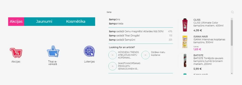
Product search, in fact, is a very important tool to promote the sale of an online store and have a positive impact on the user experience. Users use a search when the product they need is not found through navigation, for example, a section or category is not assigned to a particular item, but when they type in the search engine, the customer finds the item. It is very important, in the process of developing an online store, to create and optimize the search engine based on customer behavior analytics in online stores.
Categories and filters are very important search tools. For example, if there is a sale in an online store, but the items in this promotion cannot be divided into specific categories or filtered. In this case, the customer will not spend much time in your online store to go through the entire range of goods if they are interested only in promotional goods.
If you plan to create regular promotions, include the "promotions" section in the store!

NO. 7 Inappropriate ads
We can apply this more to ads on social networks like Facebook. Let's take advertisements for large clothing stores as an example. The store advertising offers to view different types of clothes on the slides, sorting on the side. You like some shoes or a specific piece of clothing, but by clicking on the advertisement, you get taken to the home page of the online store or a specific clothing section, but not to a specific item. One of the reasons is that the ad has the wrong URL. In such an advertisement, something specific has drawn the attention of the customer, and if the imposition on the goods of interest does not direct the customer directly to it, the customer will most likely leave the online store immediately or after a couple of unsuccessful searches.
NO 8 Hidden costs
When shopping in an online store, as well as in a regular store, the prices of products are tracked. Sometimes there are situations when a product with a favorable price or promotion is picked up on the shelf of the store, but when you come to the cash register – a surprise! The price of the item, it turns out, is higher, as indicated on the shelf. For the most part, we feel upset, frustrated and disappointed by this situation and give up the goods. This is exactly the outcome expected in the online store. If it is found that the prices of the products are initially indicated, for example, without VAT, at the time of purchase, no discount code shall be worked, or only at the time of purchase a customs duty is notified, or a high cost of delivery. The customer is likely to leave the shopping cart and never return again.
In order to prevent the purchase basket from leaving, the customer should be informed in advance of additional costs, for example, at the product description or by placing the item in the basket.
These are not the only reasons why customers leave the online store without making a purchase, but one of the most common reasons. To develop an online store, attract a team that will make sure that your website does not lose customers!
If you are also an online store owner or are mature for the development of an online store, be sure to think about these 8 points. Get into the customer's shoes and go through your online store, look at the statistics of the page and see if any of these points are about your online store.

